HomePlate Youth Services
Brief — Develop a new brand and content that gives staff the tools to communicate clearly with program participants and the broader community
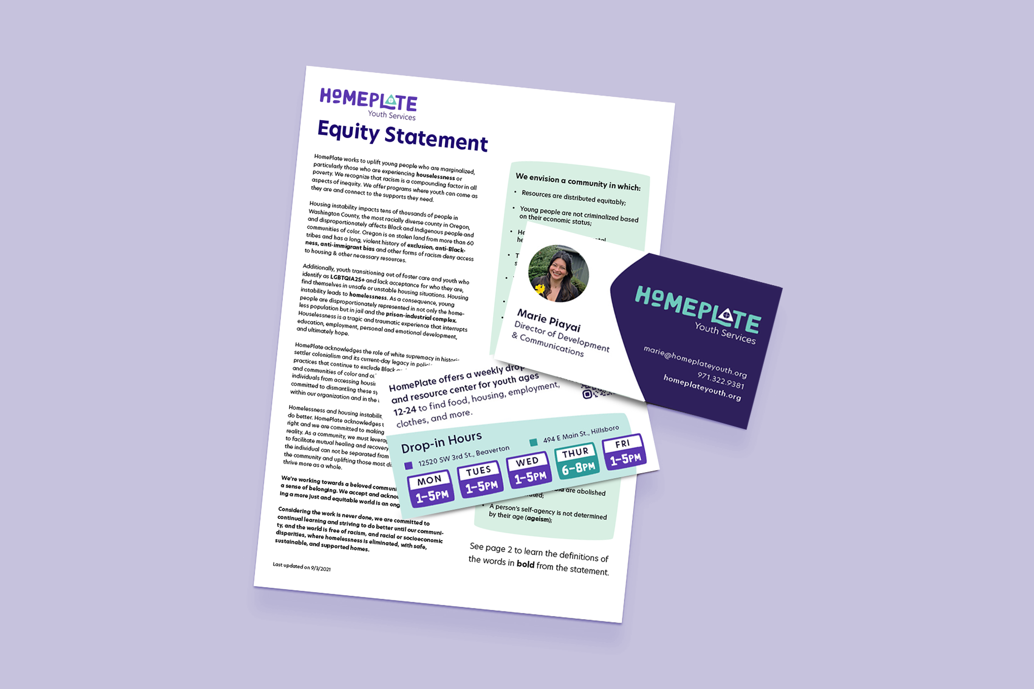
In December of 2020, HomePlate Youth Services hired a new Director of Development, Marie Piayai, who recognized pretty quickly that she didn’t have the professional marketing materials she needed to fundraise and engage with donors.
Heading in to the second year of the pandemic, another endeavor began for this nonprofit; they started fundraising to purchase and renovate a new building for their programs. The capital campaign for a new building and more robust housing options for their youth became integral to their rebrand.
Role / Project Lead
Skills / Rebrand / Brand Strategy / Logo Design / Print Design / Web
Team / Jess Leftault / Marie Piayai, Communications Director / HomePlate Youth & Staff Members
Rebranding the Organization
A key factor in this rebrand was the organizations’ desire to include the youth they serve in the rebranding process. Getting their opinions on design direction and color palette. We held a series of meetups where youth could tell us about how they viewed HomePlate’s personality and eventually vote for their favorite direction.
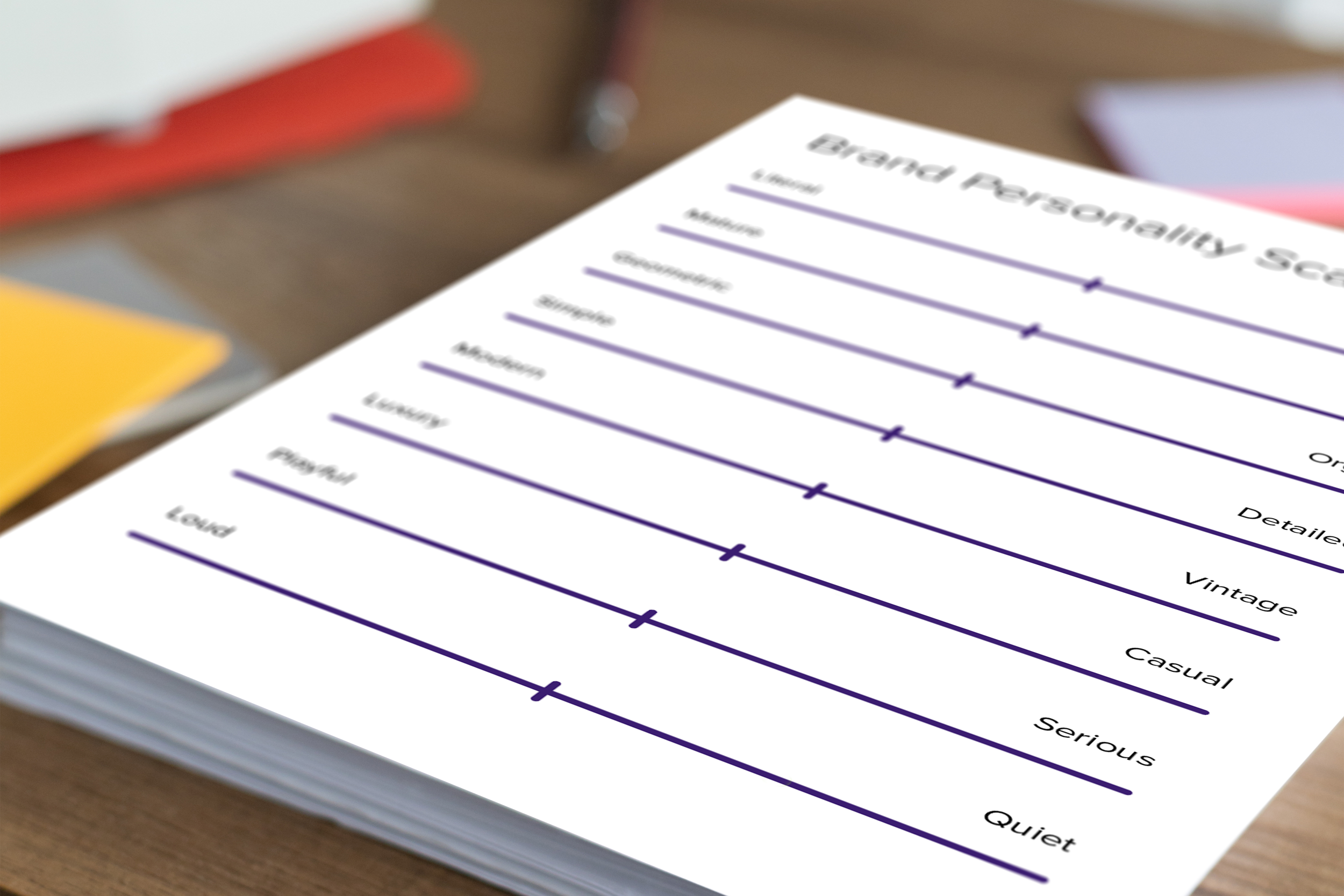
This brand personality scale was used with youth to gather data about their views of the organization.
meeting youth where they are
The New Logo
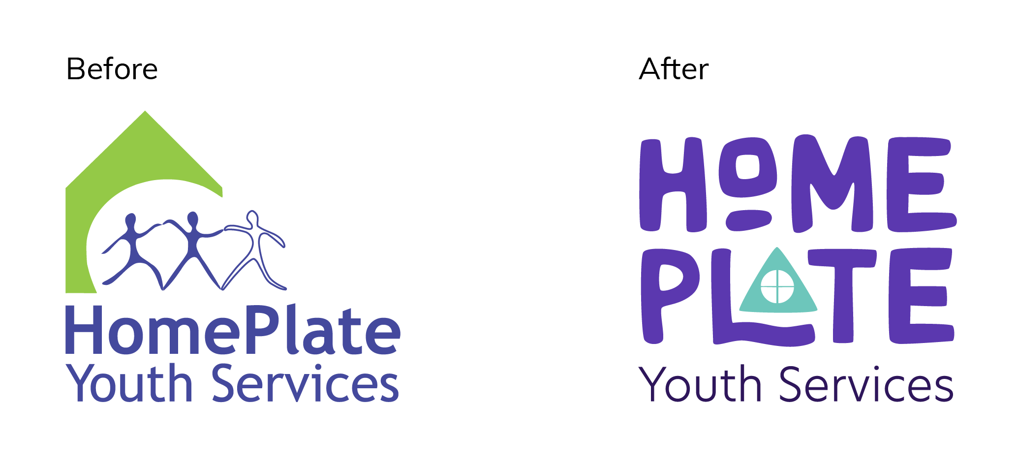
After working closely with program youth, staff, and the board to
Typography
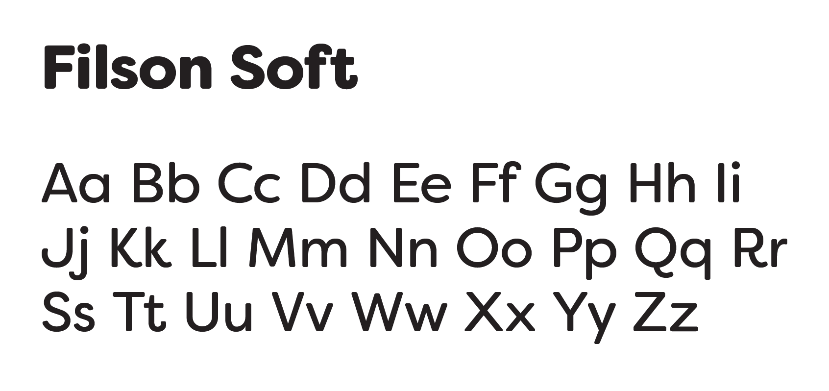
With the logo being primarily a workmark, typography was crucial to the logo itself. I wanted something that was unique and strong, but also approachable and a little playful. The rounded corners and geometric characters of Filson Soft fit the bill.
Color Palette
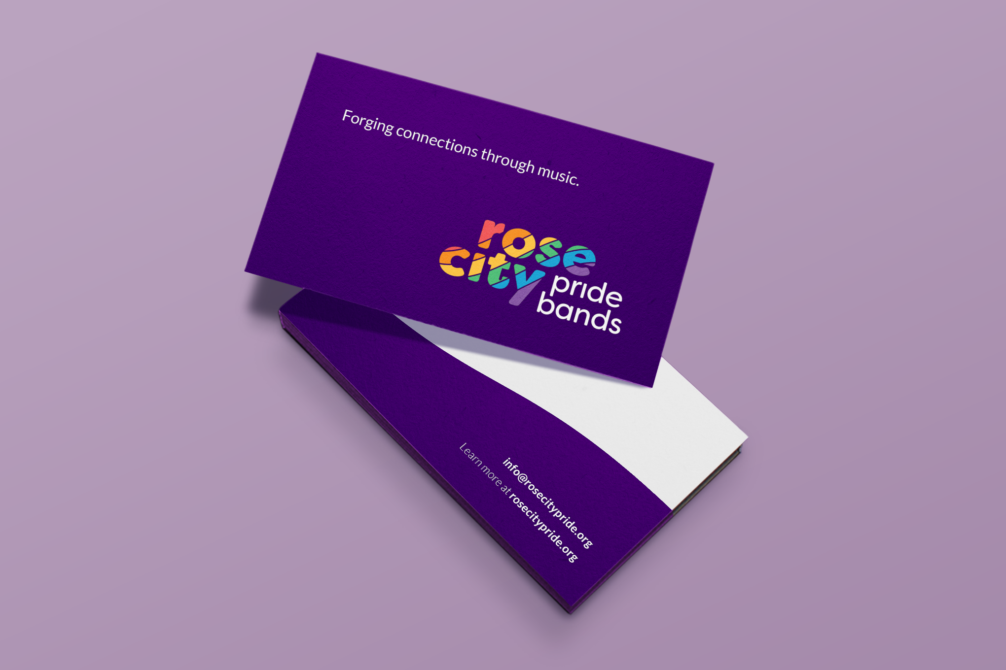
When working with queer oriented nonprofits, inevitably the question of how to integrate the rainbow into their logo comes ups. I took a more muted approach to the palette that felt warm, but not overwhelming.