Rose City Pride Bands
Brief — Develop a new brand and common language to help a local performing arts nonprofit elevate their presence in the community and bring in new audiences.
In June of 2015, I joined the board of what was then known as the Rose City Gay Freedom Bands. I was a long time supporter who had played with several of the bands. I was approached by the chair about unifying the bands under one banner while maintaining some individuality for each group.
What started as a short conversation became a multi-year process to redefine the organization’s identity. By the end of the process, we would have a new name and set of logos for the organization, new mission and vision statements, and the confidence to believe the organization could do bigger things.
Role / Project Lead
Skills / Brand Strategy & Renaming / Messaging / Logo Design
Team / Jess Leftault / Denny Richard, Board Chair / RCPB Board and Membership
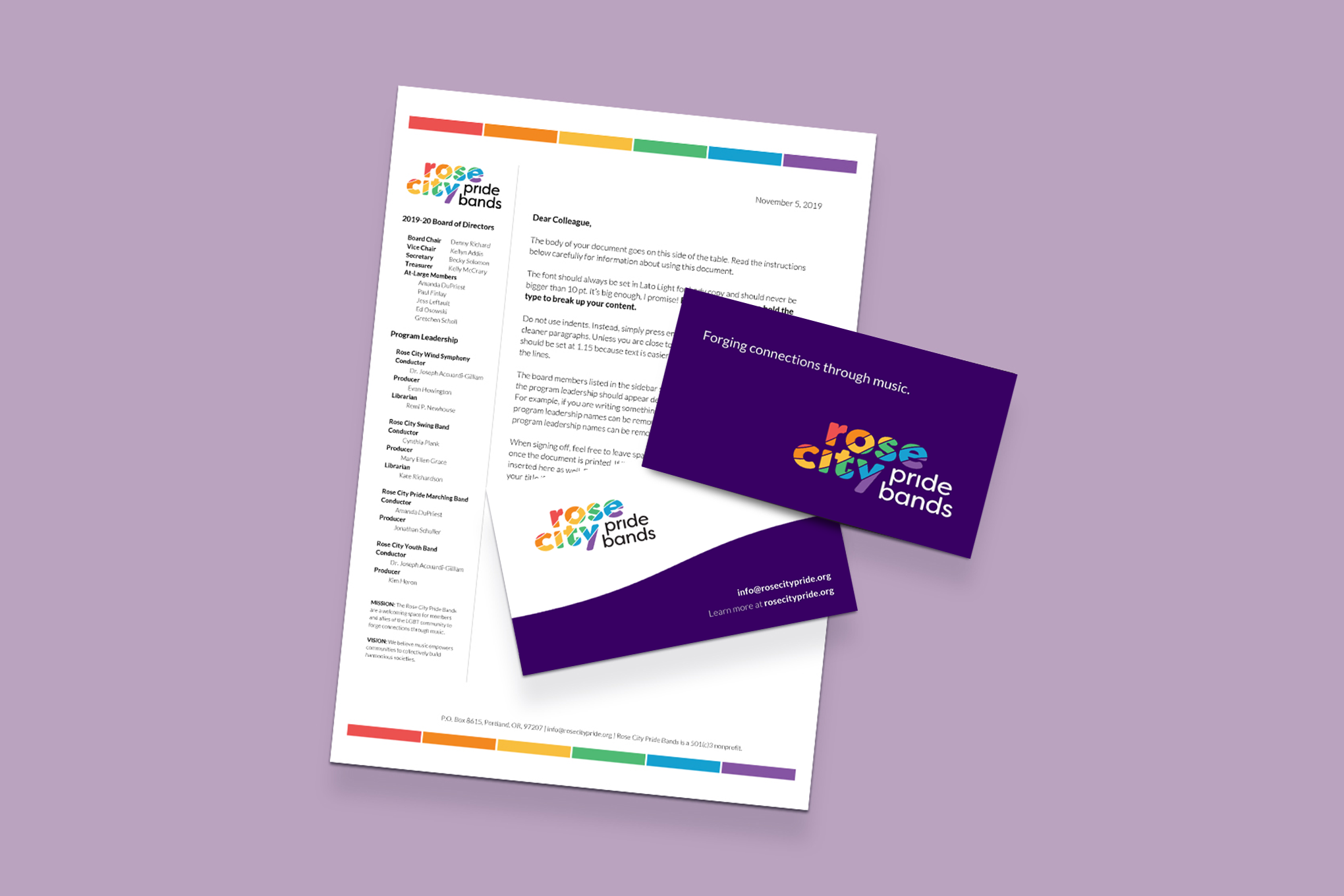
Renaming the Organization
After many long conversations with the board, band members, and other stakeholders, a new name for the organization and its individual groups was decided. What was formerly known as the Rose City Gay Freedom Bands became the Rose City Pride Bands.
Along with this new name came a new mission and vision for the organization:
Mission
RCGFB is a welcoming space for members and allies of the LGBT community to forge connections through music.
Vision
We believe music empowers communities to collectively build harmonious societies.
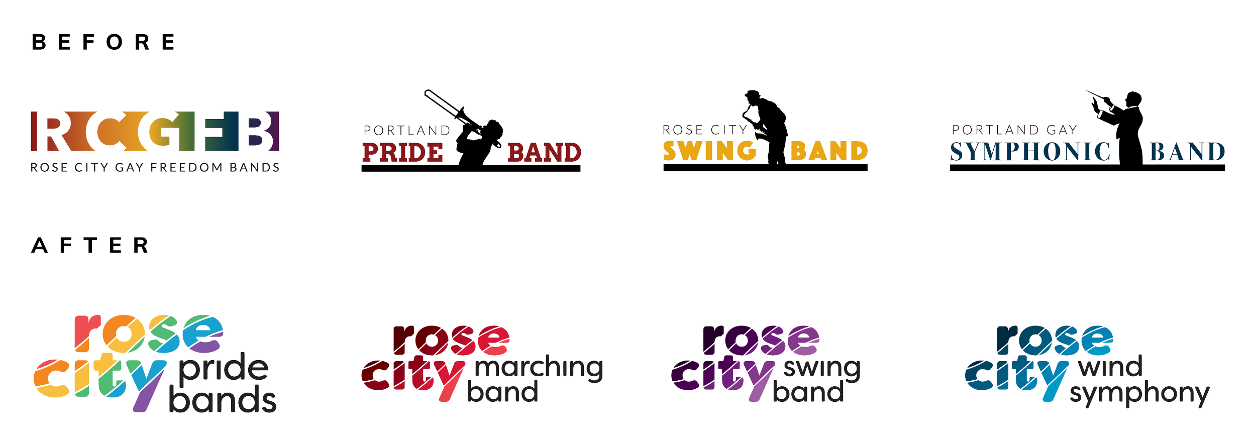
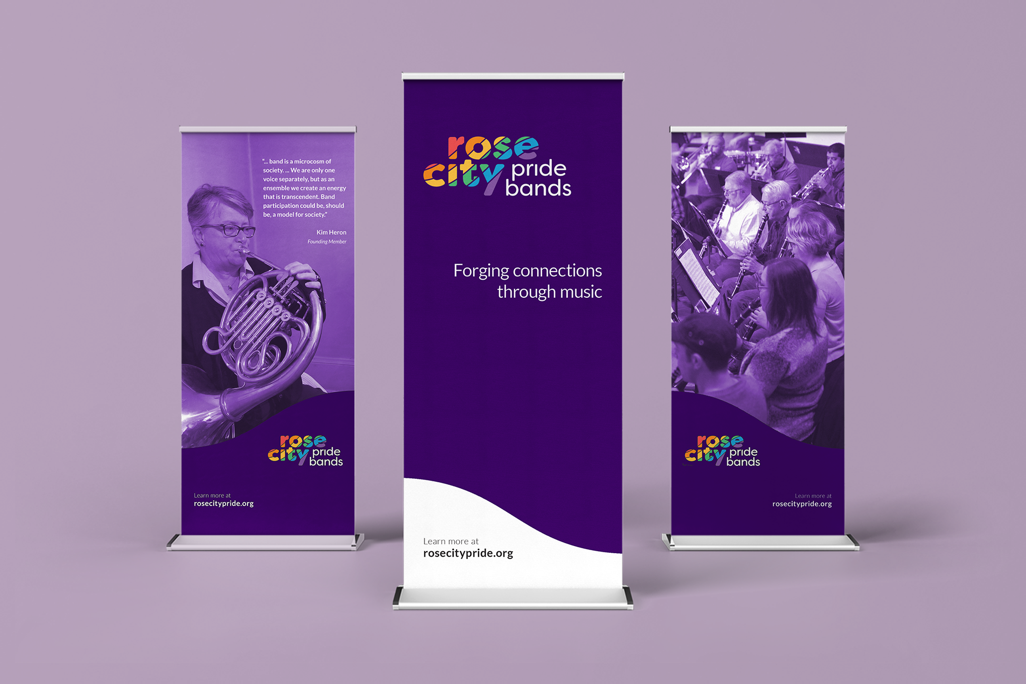
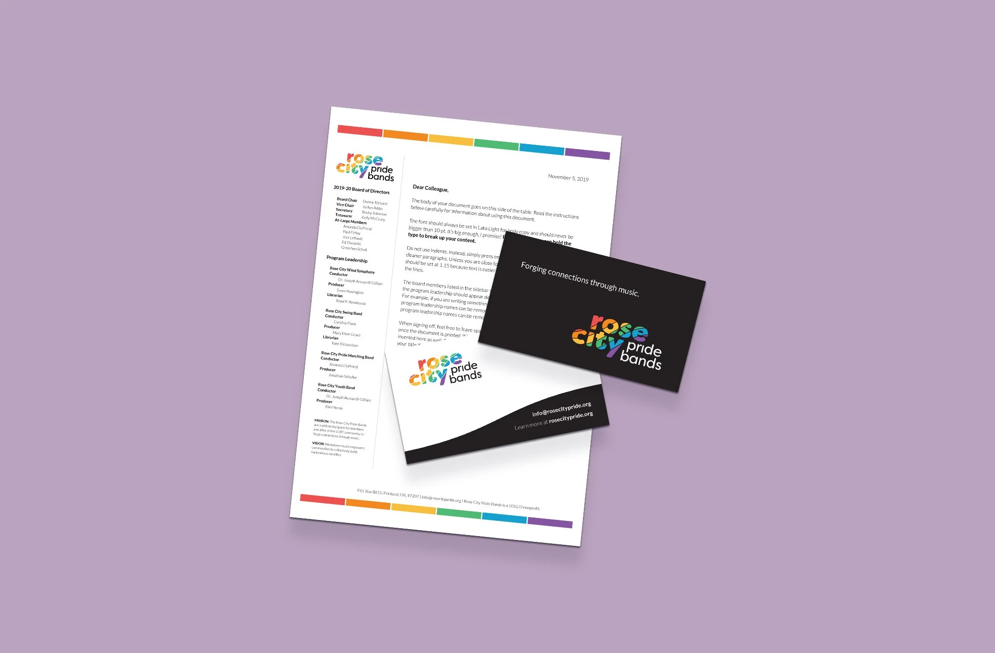
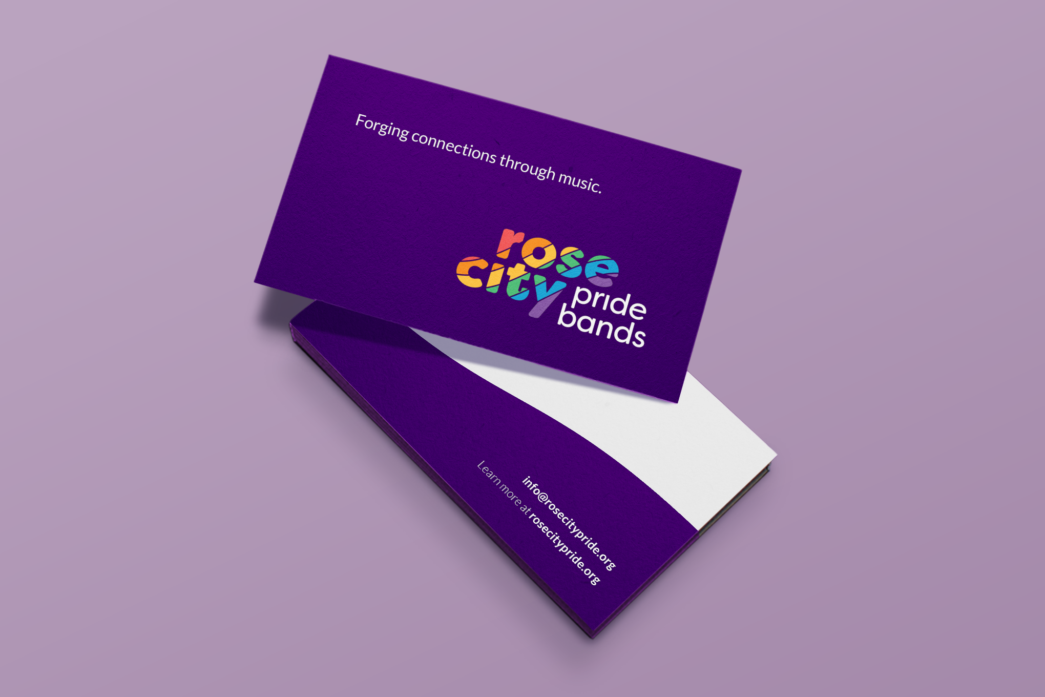
forging connections through music
The New Logo
After development of the bands common language and naming, we knew that we wanted to position ourselves as the connecting piece between music and the LGBTQ+ community.
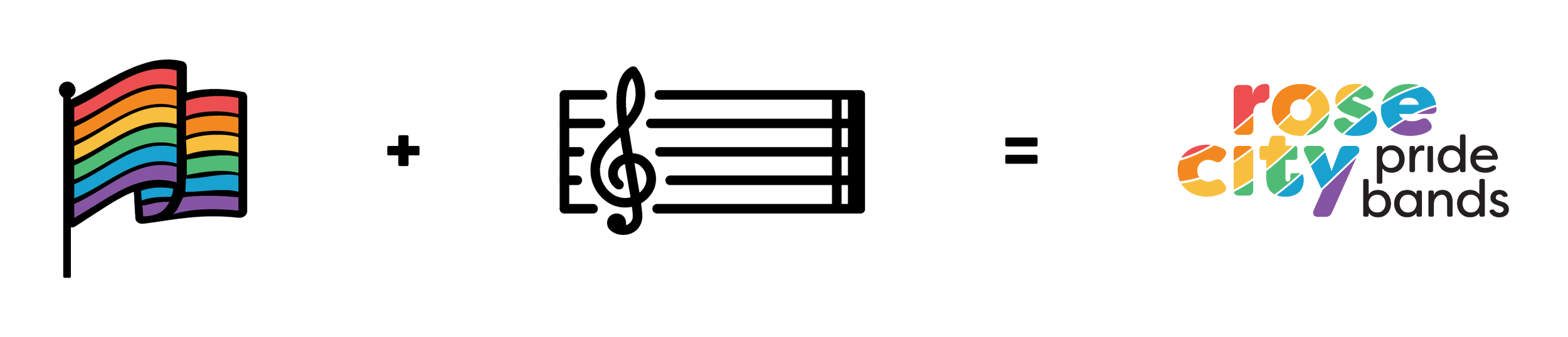
Typography
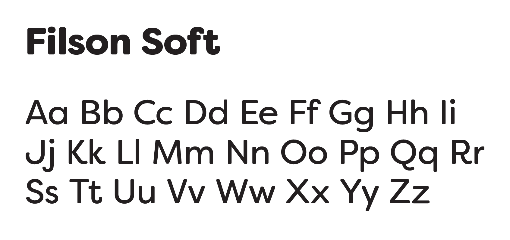
With the logo being primarily a workmark, typography was crucial to the logo itself. I wanted something that was unique and strong, but also approachable and a little playful. The rounded corners and geometric characters of Filson Soft fit the bill.
Color Palette
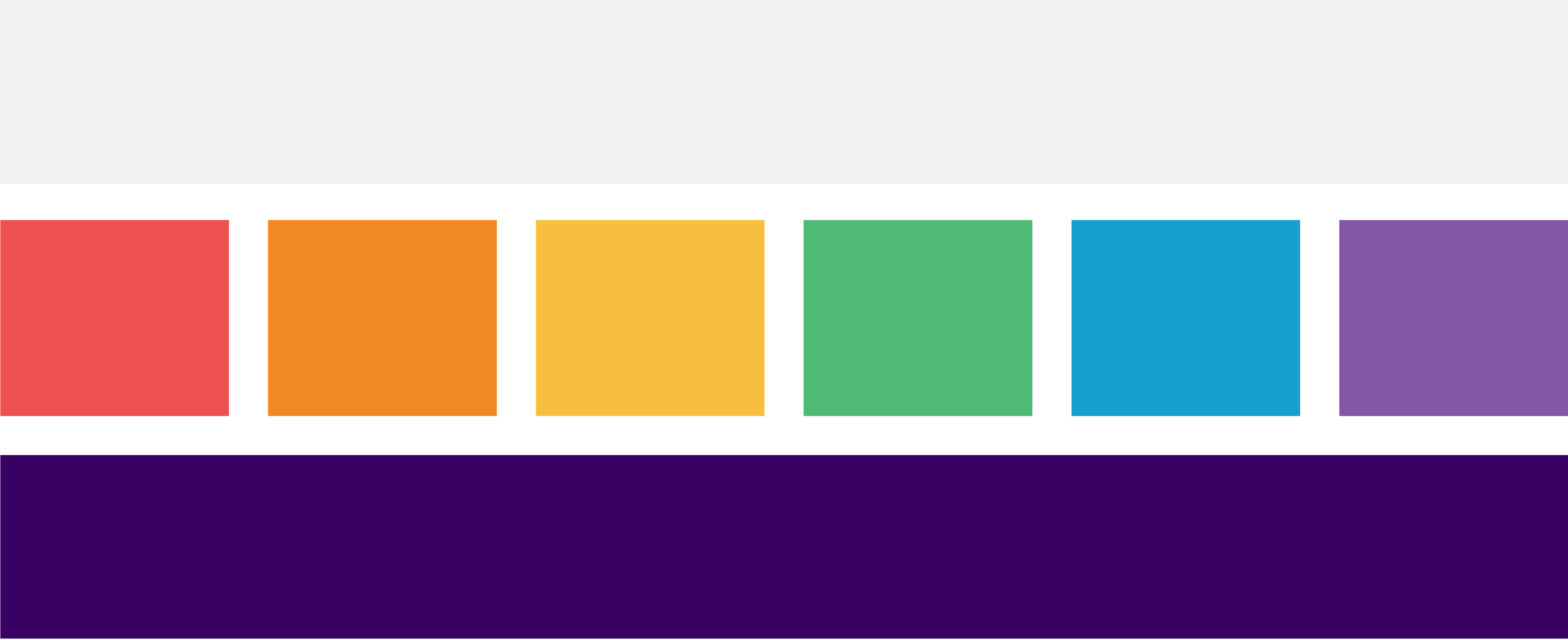
When working with queer oriented nonprofits, inevitably the question of how to integrate the rainbow into their logo comes ups. I took a more muted approach to the palette that felt warm, but not overwhelming.