
Daughters Market
Startup Brand Identity
Graphic Design, Brand Development
Be the next wave
Daughters Market sits at the forefront of the fight to build financial independence for woman-owned businesses. It provides a marketplace for female-identifying people to sell their own wares and take back the monetary power they are currently being denied.
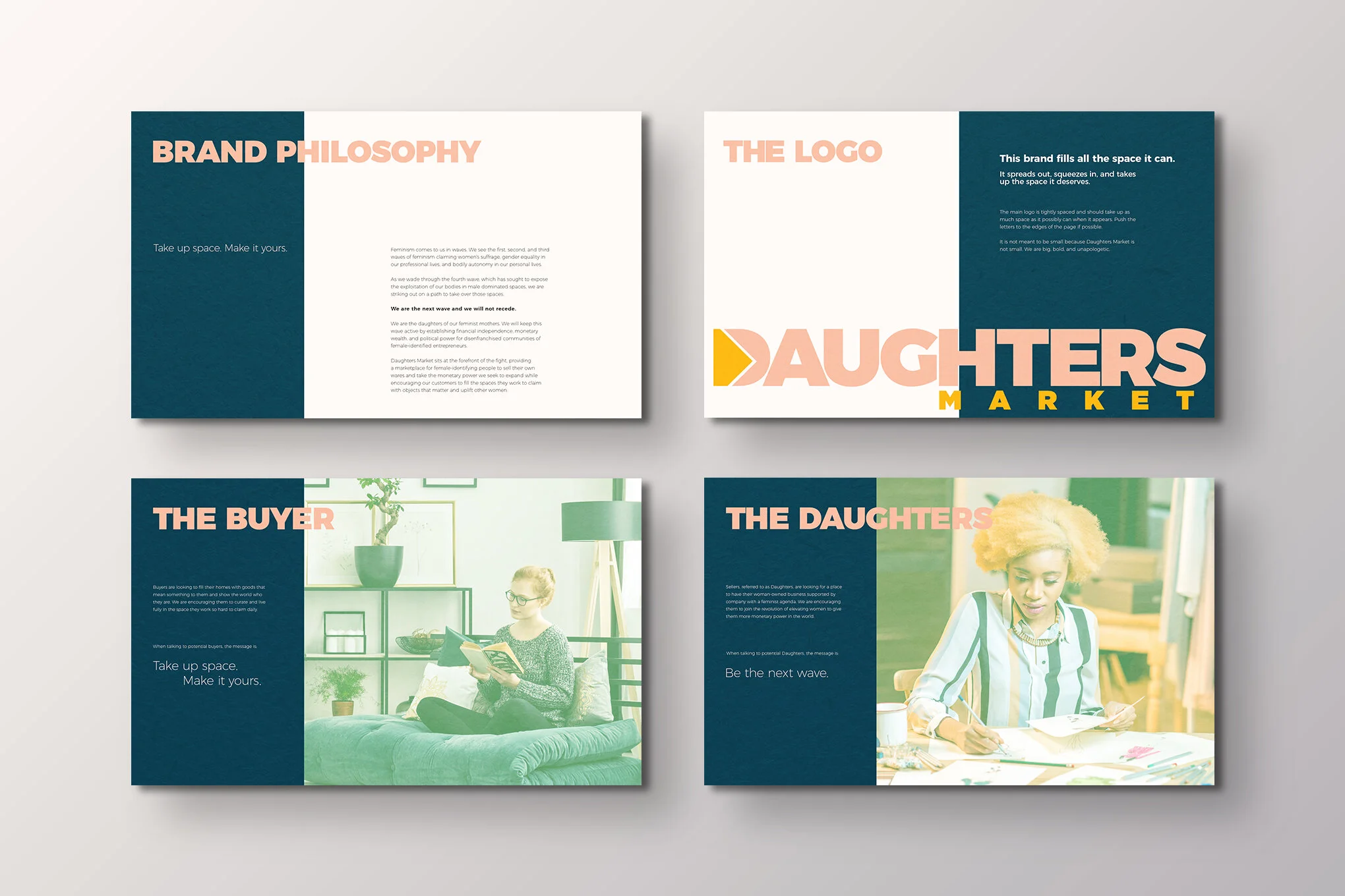
Daughters Market seeks to expand the financial strength of woman-owned businesses while encouraging customers to fill the spaces they work to claim with objects that matter and uplift other women.

The Problem
What does it mean to be a daughter?
Tess, the founder and owner, approached me with the name Daughters Market. After polling some female-identified friends, she was concerned that the word ‘daughter’ was exclusive to some of the demographics she was trying to reach. We were very aware that many women have complicated relationships with their mothers or don’t identify themselves as daughters.
How would trans individuals, a key constituency she hoped to reach out to, feel about being a ‘daughter?’ We knew we would have to address this discrepancy in the way we talked about Daughters Market.

The Solution
Define Daughters as a movement
Our solution started with honing in on the connotation of ‘daughter’ that means ‘those who came after.’ We are the daughters of our feminist mothers, the women whose shoulders we stand on today.
We began to think of the ‘daughters’ as members of the community Tess was trying to build. The Daughters are the carefully curated sellers featured in the marketplace and when the brand is talking to them, the message is "Be the next wave.”
We also developed messaging for our buyers. They are looking to fill their homes with goods that mean something to them. We are encouraging them to curate and live fully in the space they work so hard to claim daily.
Brand Elements and Usage
A brand all women can own
Our goal was to create a brand that was approachable and not overly gendered. While Daughters is reaching out to woman-identified people, it was important to acknowledge that not all women like pink. We focused our intentions on creating a brand that many types of women could claim as their own.
We used a bold font, Montserrat, to express the gusto with which Daughters approach their work. Daughters is unapologetic and takes up the space that is rightfully ours. The color palette similarly evokes the balance between soft and bold. It allows the brand to stand out when needed but still has some of the softness of womanhood.

Conclusion
The Daughters Market brand came about because of Tess’ vision of a marketplace that appeals to many types of women. We focused on defining the community we wanted to speak to and developed a brand that appeals to the broad spectrum of folks we welcome to the marketplace.
